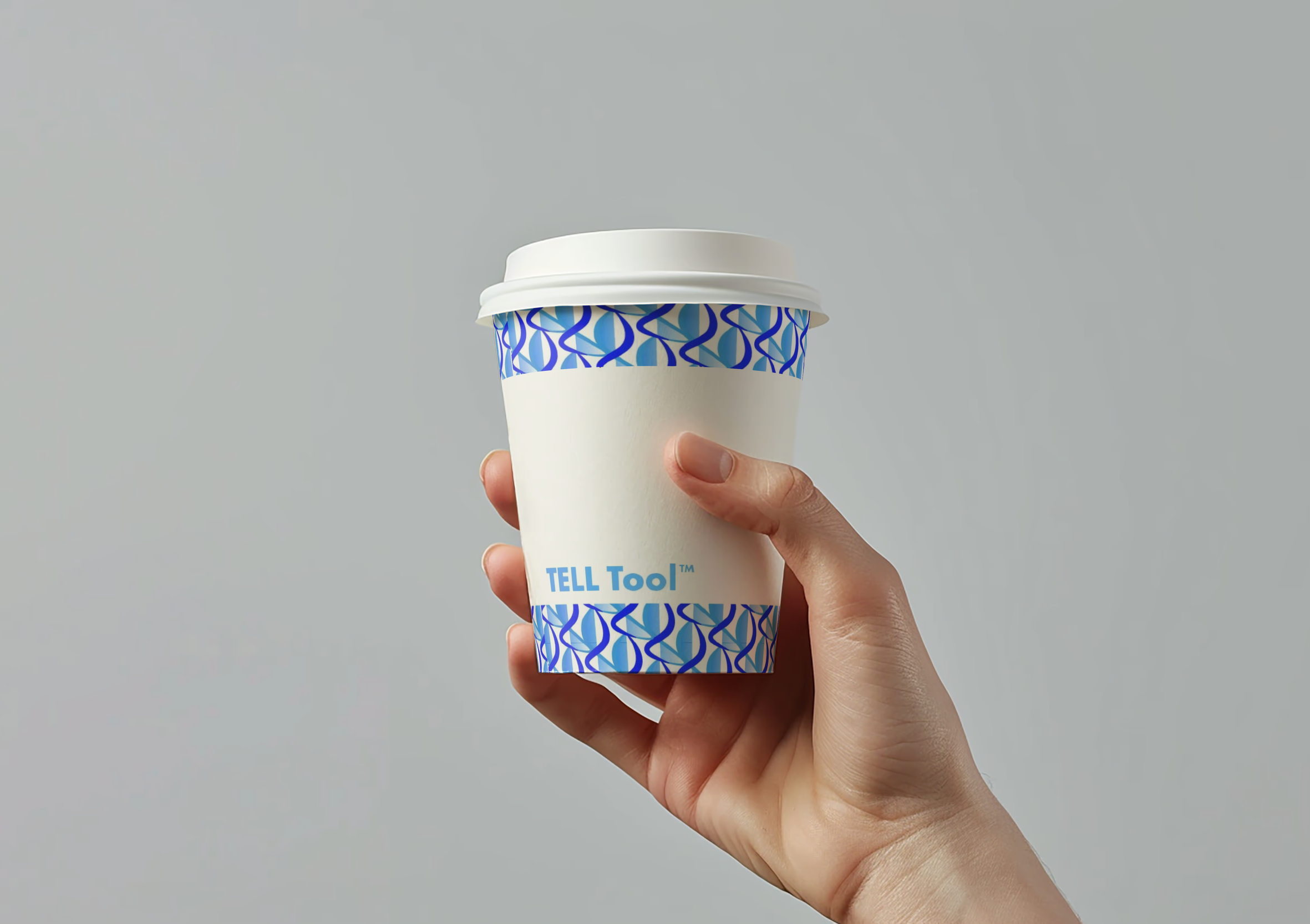
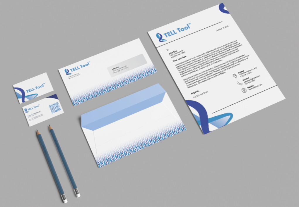
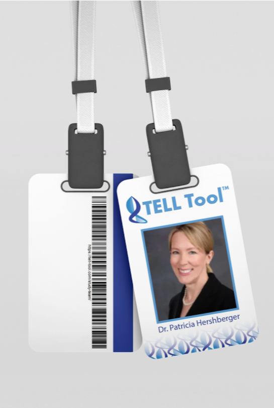
The TELL Tool visual identity
Overview
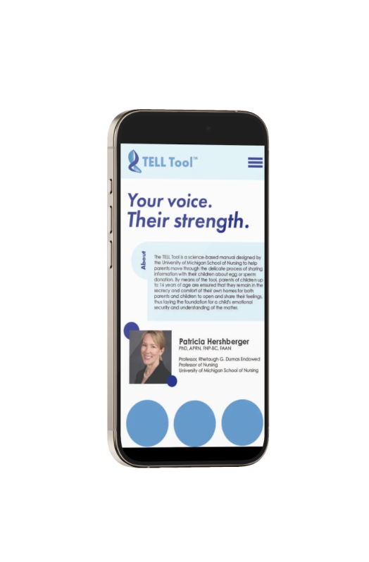
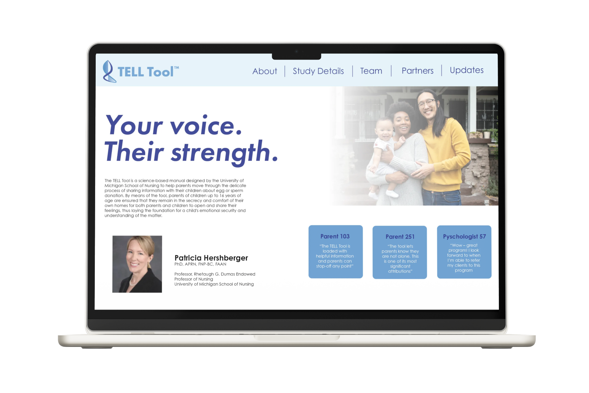
The TELL Tool is a science-based manual designed by the University of Michigan School of Nursing to help parents move through the delicate process of sharing information with their children about their egg or sperm donation.
Role: Designer
Project: Identity, packaging, way finding
Tools: Illustrator, Photoshop
Winter 2025
Past logo designs were too literal, making them difficult to use in different applications. Inclusivity was restricted by the portrayal of heterosexual and dual parent family.
Logomark
Final logo mark approaches the conversation in a calming, empathetic, and welcoming way. Cools tones and a neutral family dynamic allow diverse audiences to relate. Stackable typography gives variety within the identity while staying recognizable.
Results
The result is a versatile identity system that works seamlessly across media: from conference booths and presentations to packaging and wearable merch. The brand’s consistency reinforces its goal of accessibility and emotional openness.
Reflection
This project taught me how to design scalable brand systems and maintain conceptual integrity across different formats and platforms.
Project Goals
My goal was to rebrand this tool to boost engagement, creativity, and understanding through elements like a website, logos, social media, conference merchandise, signage, posters, and a stationery system. Their current branding lacks development and exploration, with only an original logo and limited assets. They want to expand their identity to reflect inclusivity and care for diverse family dynamics. A unified brand across all platforms will enhance engagement, create a welcoming environment, and increase recognition among new users.
Process of new logo, exploring themes of comfort and science intertwining. Color palette embodies calm and comfort while subtly hinting at the University of Michigan’s medical research.
Initial ideation exploring different forms.