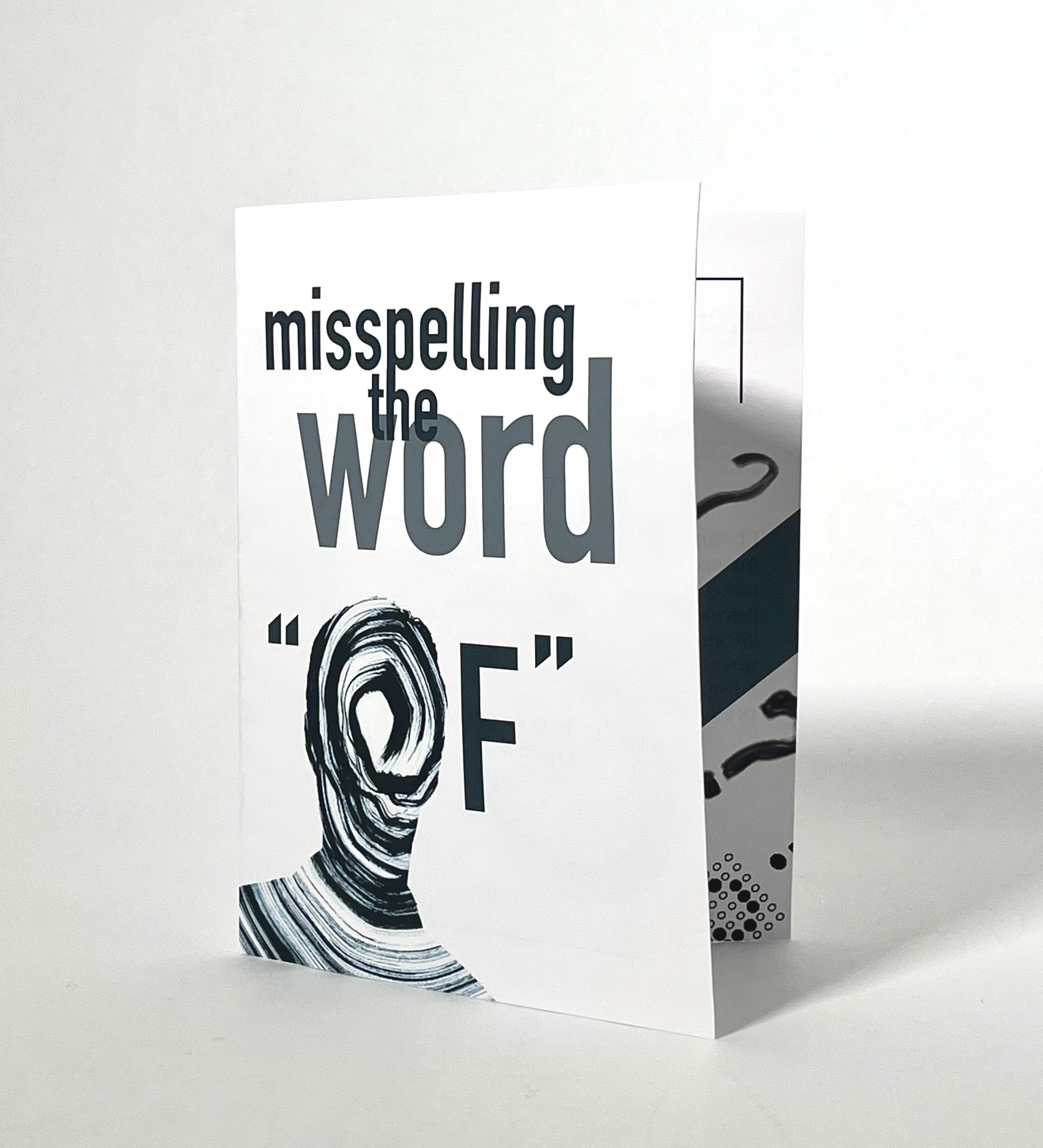
Fall 2024

MISSPELLING THE WORD "OF"

Overview

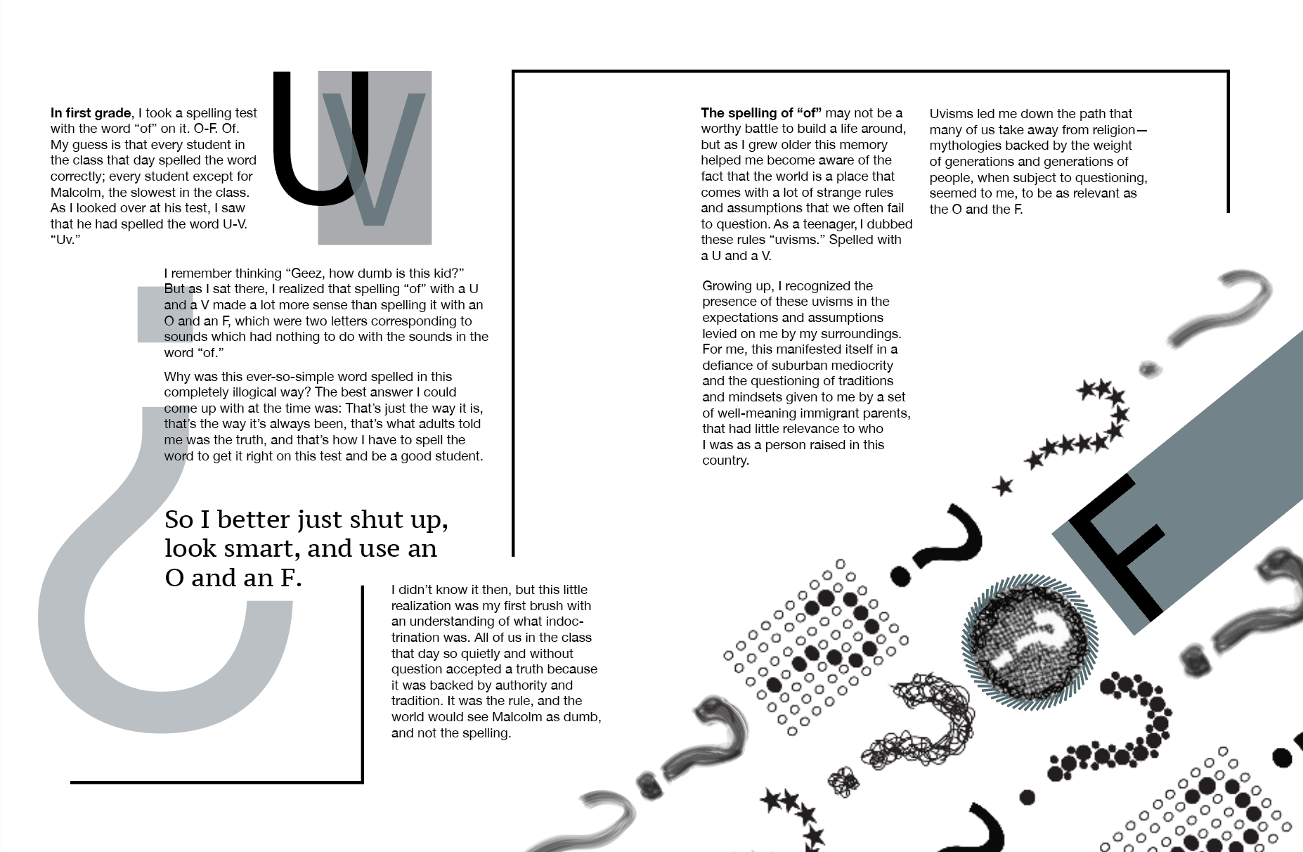
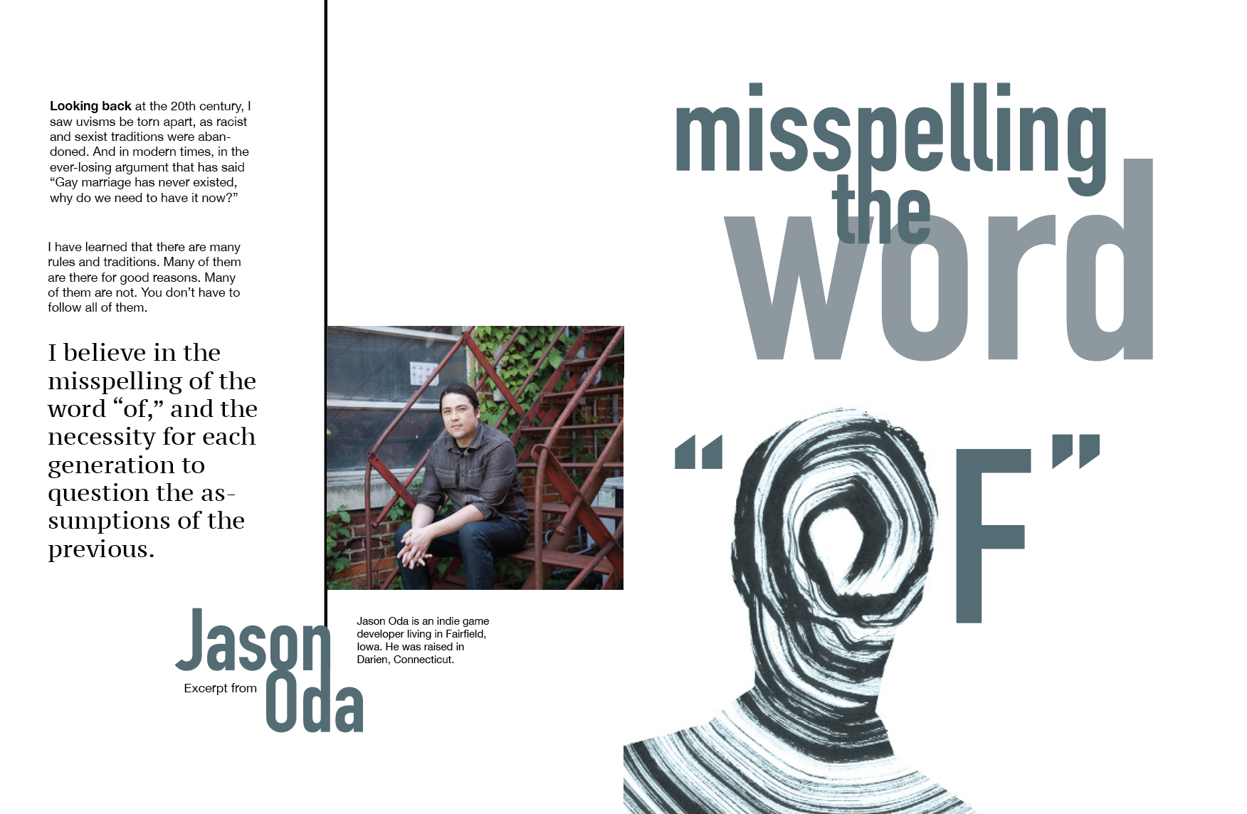
The “Misspelling the Word Of” excerpt brochure is a visual and typographic interpretation of a poem exploring language distortion, repetition, and confusion. The project includes both a printed brochure and a poster that together visualize the poem’s rhythm and tone.

Role: Designer

Project: Experimental typography, brochure and poster design

Tools: Indesign, Photoshop, Illustrator

BACK TO THE TELL TOOL

Process: Brochure

I began by experimenting with grids and paragraph separation to preserve the author’s intended pacing while introducing visual variation. A five column grid allowed flexibility for overlapping text boxes and alternating line lengths. I explored how direction, spacing, and bars could lead the reader’s eye between ideas.

As the design progressed, I refined page layouts to balance clarity with disorientation by using type scale, image, and line length to echo the essay’s internal questioning. Developing the cover last helped unify tone and concept, ensuring the visual system tied together across spreads.

Results

The final brochure and poster create an immersive reading and viewing experience where type becomes both language and image. Together, they invite the viewer to question how meaning is constructed and how easily it can warp.
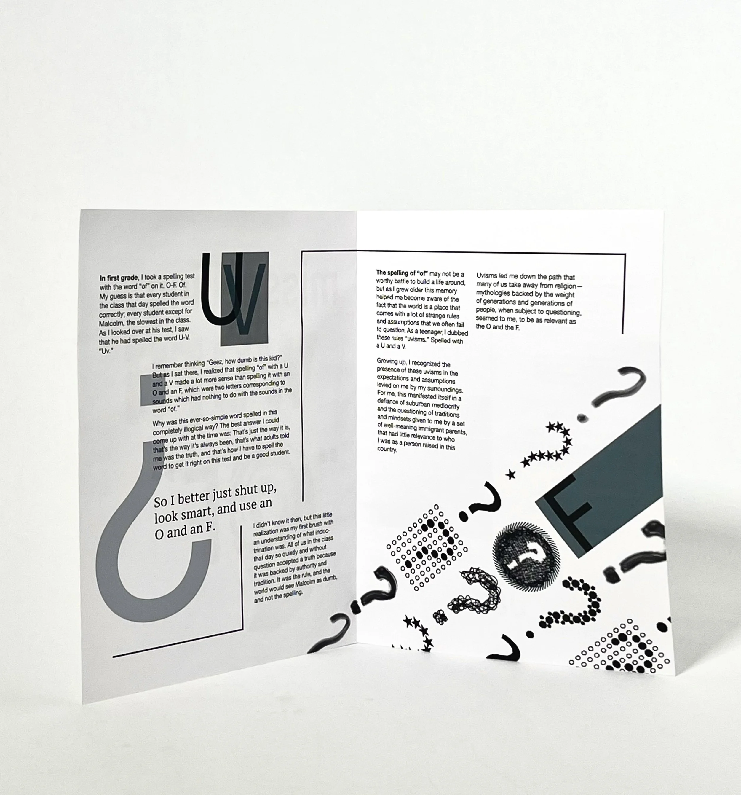
Reflection

Through this project, I learned how to maintain consistency across multiple forms while still allowing each to serve its own communicative purpose. The process challenged me to push expressive typography beyond aesthetics and use it as a direct extension of critical thought.

Process: Poster

For the poster, I focused on capturing the essay’s frustration and confrontation with conformity. I began by selecting the quote “The world comes with a lot of strange rules and assumptions that we often fail to question” for its critical and reflective tone. My early iterations explored type hierarchy and spatial rhythm to emphasize the sense of judgment toward the viewer.

Through experimentation, I moved beyond color based emotion and began using form as expression such as cutting off the bottoms of words, layering transparent planes, and using disappearing bars to guide the eye through the question mark and into the main quote. This distortion of text reflected the idea of “falling short” and visually communicated the breakdown of unquestioned systems.

Final Spread

Final Poster

NEXT UP: A/SQUARED MAGAZINE